Comparing Mortality Rates with Pie Charts
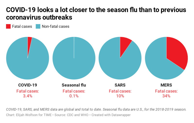
These four pie charts created for “The WHO Estimated COVID-19 Mortality at 3.4%. That Doesn’t Tell the Whole Story” from Time depict the percentage mortality rates for COVID-19, the seasonal flu, SARS, and MERS. However, using pie charts that represent parts of a whole instead of a visualization genre that includes time ignores COVID-19’s longer incubation period.
Graphing New COVID-19 Cases
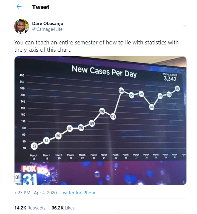
Dare Obasanjo’s tweet from April 4th, 2020 shows a line graph taken from Fox 31. The graph is titled “New Cases Per Day” with the “Total cases 3,342” listed in the upper right corner. The x-axis includes a label for each day between March 18 and April 1; the y-axis starts at 30 and ends at 400. Although the vertical space between numbers on the y-axis stays constant, misrepresenting the numerical difference between numbers.
Explaining Net Hospital Admissions in New York City
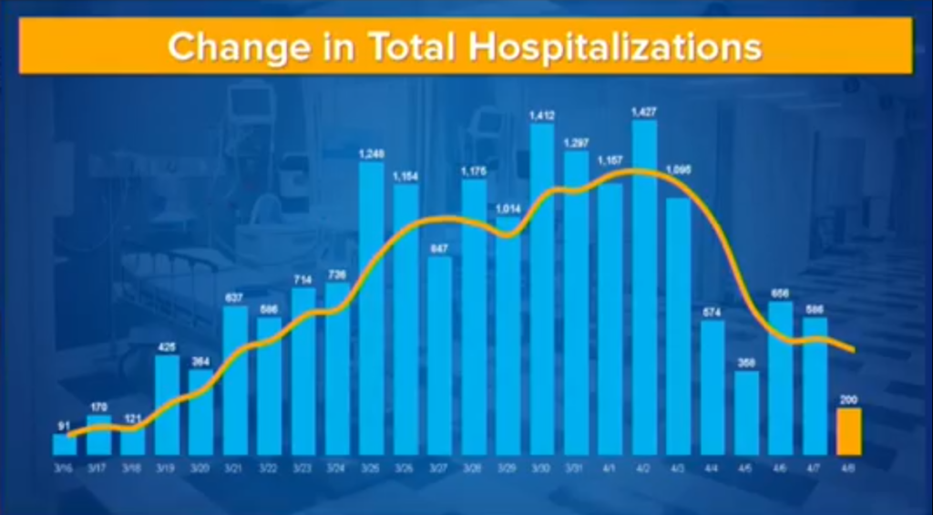
The Change in Total Hospitalizations chart is taken from Governor Andrew Cuomo’s daily media briefing from April 9th, 2020. This bar chart measures the net change in total hospitalizatioms from March 16, 2020 to April 8th, 2020; each of the bars in in light blue, topped with a white data label, and highlighted with a yellow trendline. Hospitalizations peaked with 1,427 on April 2 and dropped to 200 on April 8th. However, the net decrease in hospitalizions drops so low on April 8th that this chart could lead people to believe that risks from COVID-19 have been minimized.